
Create a reusable size guide, information popup or product tab: choose the products, build the content, set how it appears, then publish and check it on your storefront.
This guide follows the current three-step editor: Selection rules → Content → Display options. The screenshots show example settings; use your own products, measurements and item names. Click or tap a screenshot to enlarge it.
1. Open PRIKID and choose the item type #
Open your BigCommerce admin, go to Apps and open PRIKID. If it is not installed yet, follow the installation guide first.
For a size chart, inline content or product tab, select Size charts and content items, then Add new content item. A size-chart popup opened by a link belongs here too. For a general popup with automatic triggers or its own buttons, select Popups, then Add new pop-up.
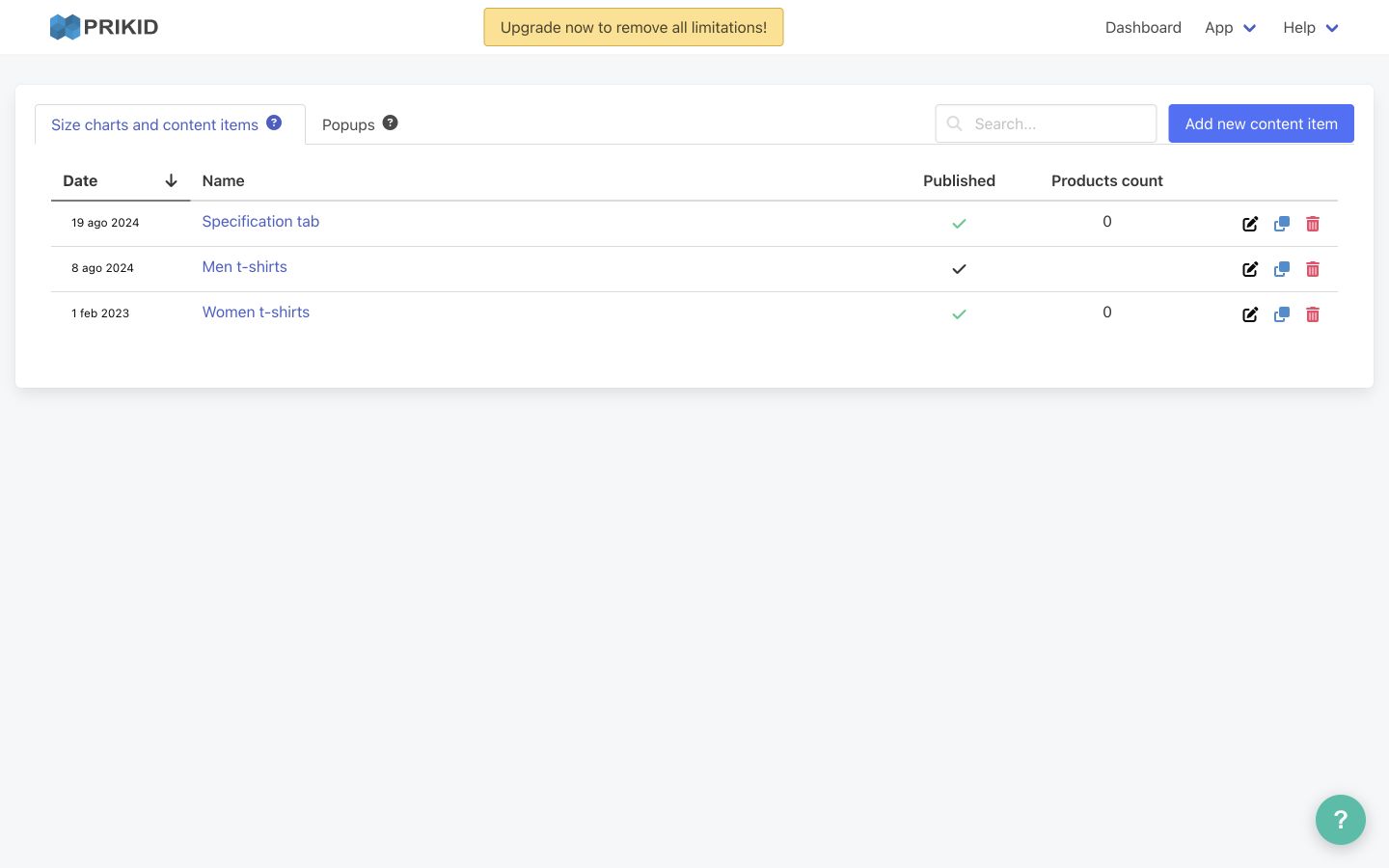
2. Select products and check matching #
In Selection rules, choose which products should receive the item. For a first setup, use Product is → in list, start typing a product name, and select the intended product from the suggestions. You can also match a product field, such as Product name → contains, using a value that exists in your catalog.
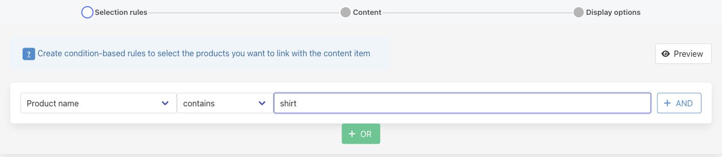
Click Preview in Selection rules to see Products that meet the conditions. Check that the intended products are included before continuing. The products shown below are an example, not a list from your store.
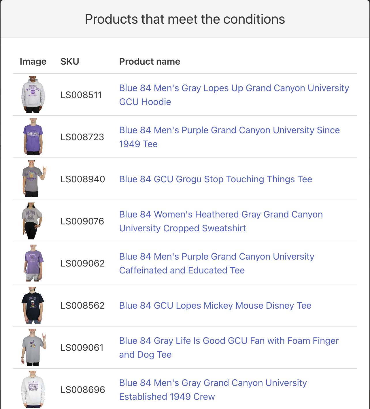
If the result is empty or includes unexpected products, use the product-targeting guide for fields, AND/OR, exclusions, regex and zero-match checks. The dashboard search finds content-item names; it does not test these rules. Close the matching Preview and click Next.
3. Build and preview the content #
In Content, create the information shoppers will see. Add blocks from Content blocks, such as Text & Video, Image, Table or Divider, and select a block in the editor to edit it. Replace the sample text, empty table values and image placeholder with your own content.
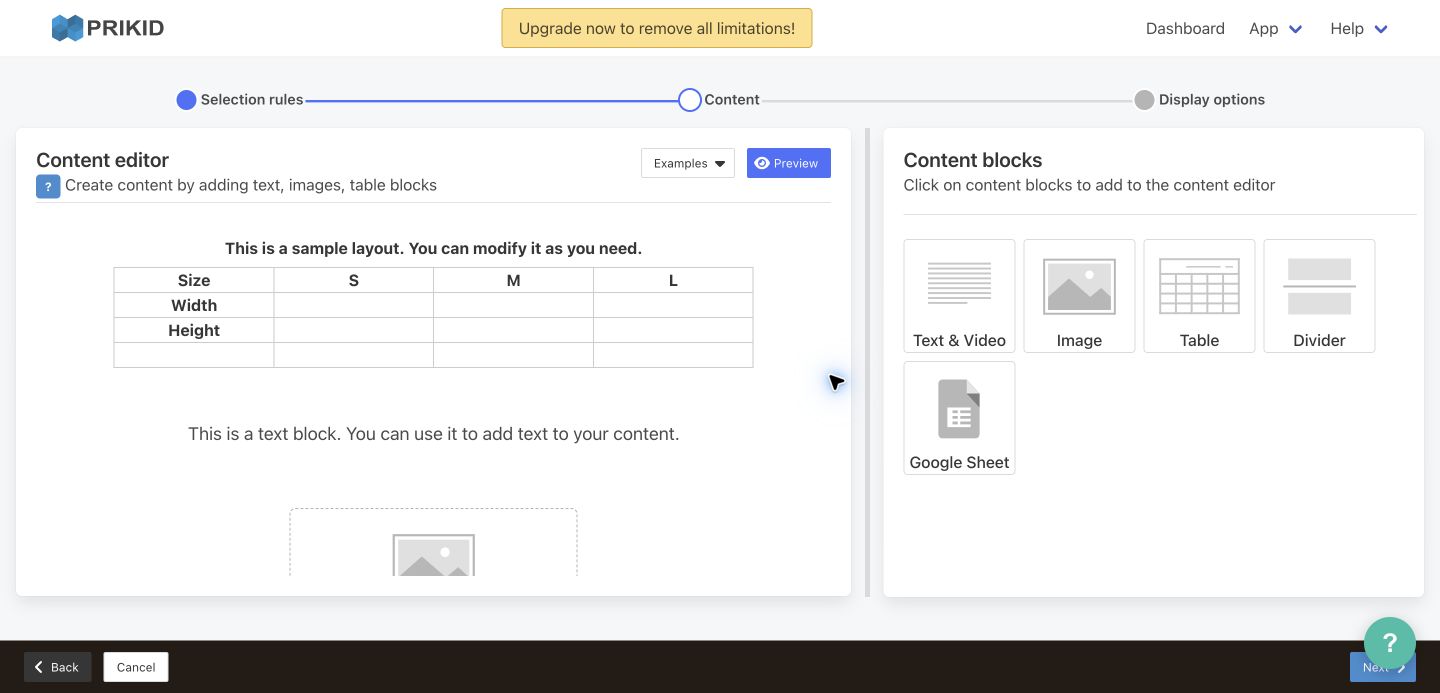
For a starting layout, open Examples and choose a suitable example, such as T-Shirt size chart. The app warns that the current layout will be cleared; continue only if you want to replace it. Sample measurements are illustrative—replace them with measurements for the products you sell and state the units clearly.
Use Preview in the content editor to review the layout. This Preview shows the content; the Preview in Selection rules checks matching products. Check images, headings and table values, then close the content Preview and click Next.
4. Choose how the content appears #
In Display options, give the item a useful internal name, such as “T-shirt size guide”. For a size chart or content item, choose a Display mode:
Open a size chart or content item in a popup #
Select Show as a link/button and open the content item in a popup window on click. Review Link/button default settings. Keep Use global enabled to use your global link settings, or turn it off to configure this item’s link/button. The item name and the shopper-facing link label are separate settings.
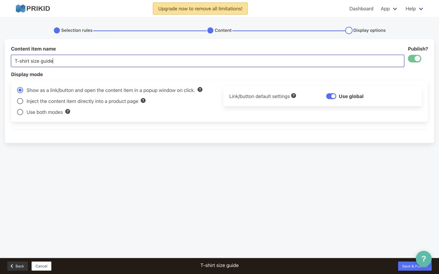
Check the actual link position on your theme. If the default location is unsuitable or the link is missing, follow the link-placement guide or contact support with the product URL and desired location.
Show the content directly on the page #
Select Inject the content item directly into a product page and leave Insert as a tab off for an inline block. Configure the insertion location using the direct-insertion guide; selecting the mode alone does not choose an arbitrary position in your theme.
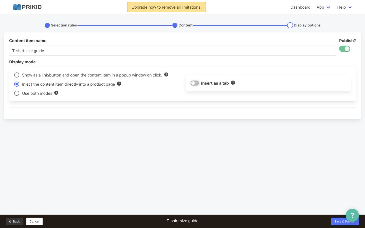
Add a product tab #
Select the injection mode, switch on Insert as a tab, and set the shopper-facing Tab title. In Insert before a tab with a matching title, use the existing tab title, --first-- or --last-- to choose the order.
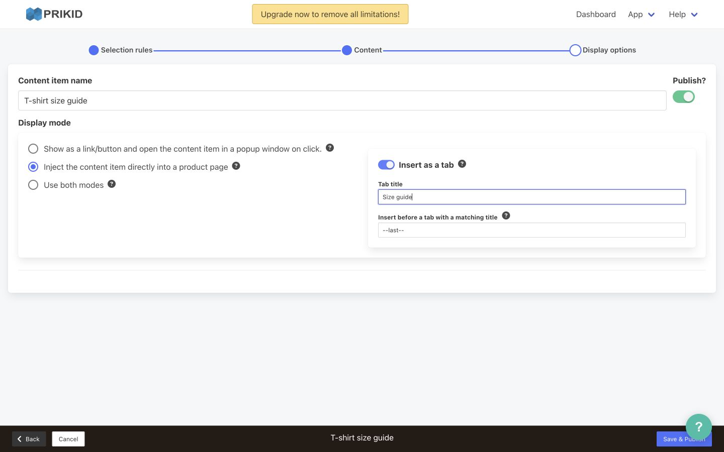
Tab insertion depends on the theme’s tab structure. A custom theme may need an adjustment; publishing does not guarantee that a compatible tab container exists. See the product-tab guide for setup and placement details. Use both modes displays content through both the link/popup and injection modes; review the settings for both.
Configure a general popup #
For an item created from Popups, Display options contains a different set of controls: Show when, Delay, s and Impressions limit, plus optional buttons. Choose the trigger and repetition limits appropriate for your popup. For a button-only popup, choose Off under Show when and configure its button placement.
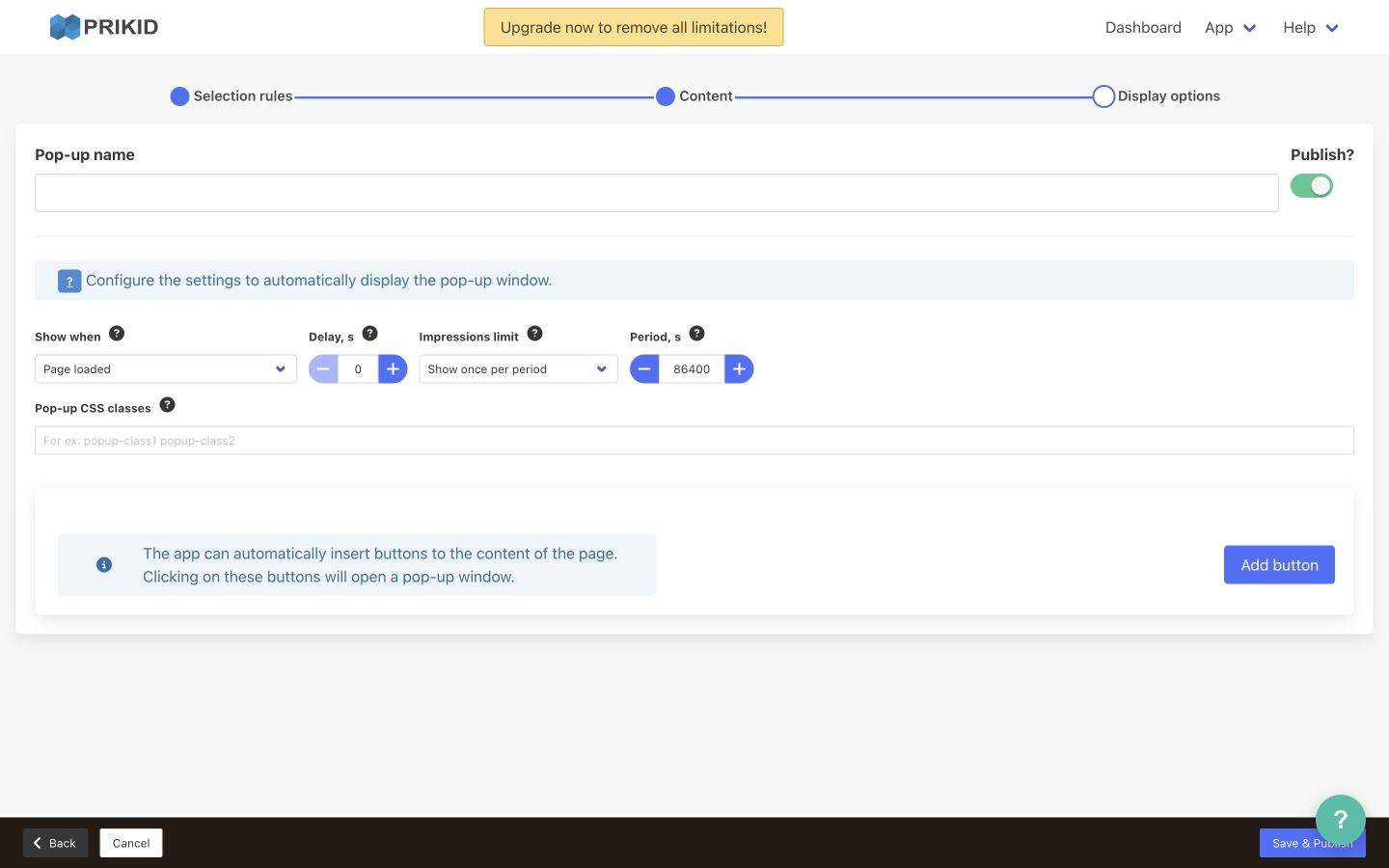
Follow the general-popup guide for these controls and button placement. Repetition limits can prevent an automatic popup from appearing again during repeated tests.
5. Save as a draft or publish #
Review the name, matching rules, content and display settings. With Publish? enabled, click Save & Publish. To keep the item unpublished, turn Publish off and click Save as draft. The popup-mode screenshot above shows where the Publish switch and save button are located.
After saving, find the item in the dashboard and confirm its published state. Saving a draft does not make it visible to shoppers. If the app shows a validation error, correct the indicated field and save again; do not assume an unsuccessful save published the item.
6. Check the actual product page #
Open a product that matched in Selection rules Preview on the storefront where you intend to display the item. If a Preview link opens the wrong domain or a 404 page, navigate to the correct product page directly and include both URLs when reporting the issue.
- Popup link: locate the link/button, click it, check the correct content opens, and close the popup.
- Inline content: confirm the block appears at the configured insertion location.
- Product tab: confirm its title and position, open it, and check the content.
- General popup: test the chosen trigger or configured button while accounting for its impression limits.
- Desktop and mobile: check readable headings and measurements, loaded images, table access, working links and the popup close control.
- Scope: also check a product that should not match, so the item appears only where intended.
If the item is published but missing #
First confirm that the item is saved and published, that the product appears in matching Preview, and that its display mode and placement are correct. Then check the app’s storefront script and theme integration. A manually added Size chart link can remain visible even when no published item matches the product; a visible link alone is not proof of a working assignment.
For a missing tab, hidden link, unreadable heading or layout problem, check the actual storefront rather than relying only on the editor. Custom theme markup and CSS can affect placement, visibility and clicks. Avoid applying old theme-specific snippets without checking your current theme.
For a quick route from your symptom to the detailed fix, use Why Your Size Chart, Popup or Tab Is Not Showing.
Still need help? Contact PRIKID support with your store URL, content-item name, affected product URL, theme name/version, expected display location, and screenshots of Selection rules, matching Preview, Display options and the storefront. For detailed matching troubleshooting, return to the product-targeting guide.


