
Give your size-chart trigger an image while keeping a readable Size chart label. A CSS background image is decorative and has no text alternative: do not replace the Title with a space, hide the text, set its font size to zero or make it transparent.
Add the image beside the label #
- Host the image at a public HTTPS URL you control, using your store’s image library or another trusted host. Open that URL to confirm it displays; use a small icon that complements the label.
- For default styling, open App → Settings → Main settings → Link/button default settings. Keep Title as Size chart or another clear action label, enable Show as a button, and add
prk-image-size-chartto CSS classes without removing existing classes. - Paste the declarations below into Inline CSS style, replacing the URL. Keep the double quotes around the URL. These are declarations only, without a selector or
<style>wrapper. Adjust icon size, padding and colors for your theme while preserving text contrast and focus visibility. - For one item, open its Display options → Link/button default settings, turn off Use global, and apply the same Title, button, class and inline-style values there. An item override can take precedence over the global defaults; inspect both if the visible result differs.
- Save in the app when ready, then reload an actual matching product page. Check the icon and label on desktop and mobile. If the image fails to load, the text should still explain the action.
background-image: url("REPLACE_WITH_YOUR_HTTPS_IMAGE_URL");
background-repeat: no-repeat;
background-size: 24px 24px;
background-position: 12px center;
display: inline-flex;
align-items: center;
min-height: 44px;
box-sizing: border-box;
padding: 10px 16px 10px 48px;
white-space: normal;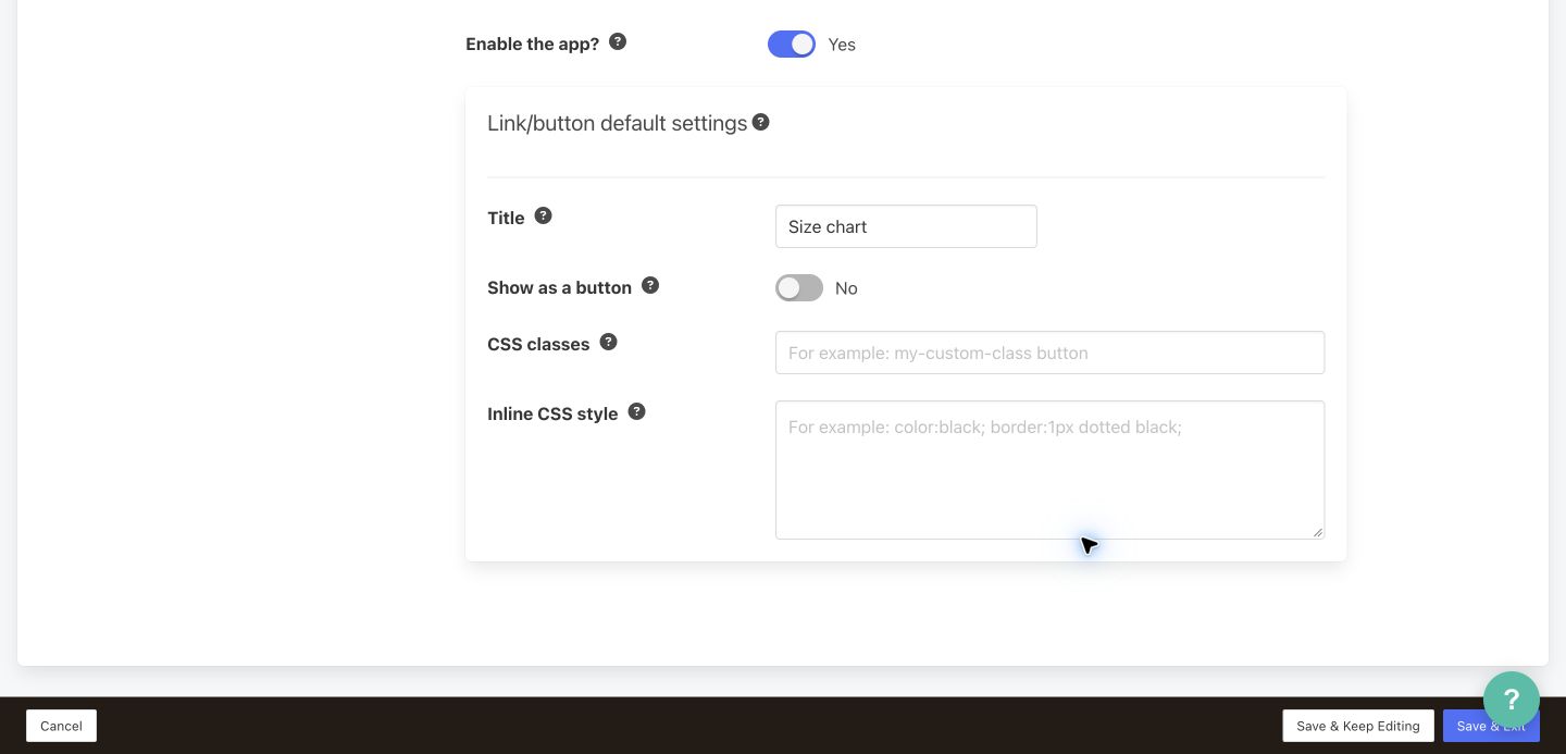
Keep the trigger keyboard-operable #
The current widget generates an <a> with class prikid-size-chart-trigger-button and a popup click handler. Button styling alone does not turn it into a native keyboard button. If your theme does not already supply keyboard support, have a theme developer add the scoped helper below in the storefront’s supported custom-script area. It adds a button role, Tab focus and Enter/Space activation only to triggers carrying the custom prk-image-size-chart class, including ones inserted later.
<script>
(() => {
  const selector = 'a.prikid-size-chart-trigger-button.prk-image-size-chart';
  const enhanced = new WeakSet();
  function enhance() {
    document.querySelectorAll(selector).forEach((trigger) => {
      if (enhanced.has(trigger)) return;
      enhanced.add(trigger);
      trigger.setAttribute('role', 'button');
      trigger.setAttribute('tabindex', '0');
      trigger.addEventListener('keydown', (event) => {
        if (event.key === 'Enter' || event.key === ' ') {
          event.preventDefault();
          trigger.click(); // Uses PRIKID's existing popup click handler.
        }
      });
    });
  }
  function start() {
    enhance();
    new MutationObserver(enhance).observe(document.body, {
      childList: true, subtree: true
    });
  }
  if (document.readyState === 'loading') {
    document.addEventListener('DOMContentLoaded', start, { once: true });
  } else {
    start();
  }
})();
</script>
Install one copy; do not duplicate existing theme keyboard handlers. Verify Tab focus, a visible focus outline, Enter and Space opening the expected chart, popup Close/Escape and usable focus after closing. This helper preserves the existing click behavior; it does not replace the popup or prove that every theme’s modal focus handling is correct. If the theme still fails these checks, ask its developer or PRIKID support to adjust the integration before using an image trigger.


